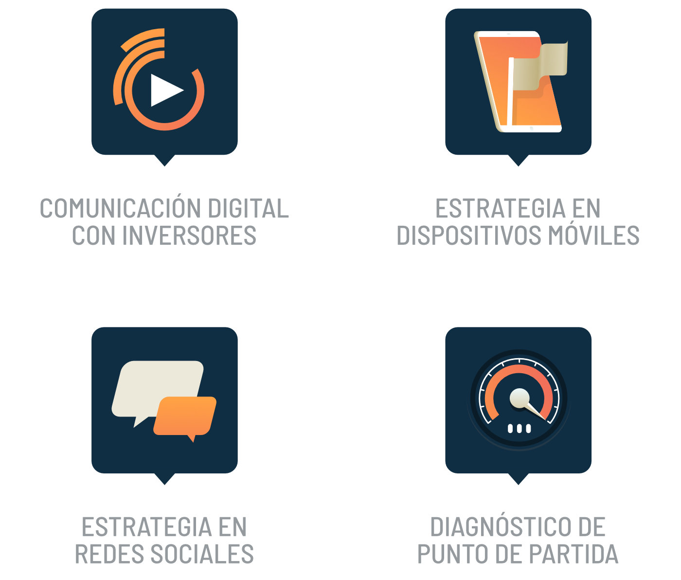
Among all forms of visual communication, the icon is the minimum unit. It is also, in all likelihood, the most present in anyone's daily life. Simply put, an icon is an image that represents an object or an idea. The preference of the human mind for stimulus visual has favored the prevalence of these abstractions as a communication tool in contemporary culture.
In the field at hand, the icon as a graphic resource in documents and tools for communicating with investors offers us not only the ability to visually summarize a concept, but also the opportunity to capture and direct the attention of the public or reader.
With this as an objective, we will analyze the 3 essential qualities of which an effective icon should show off.
It must convey the right message... intact!
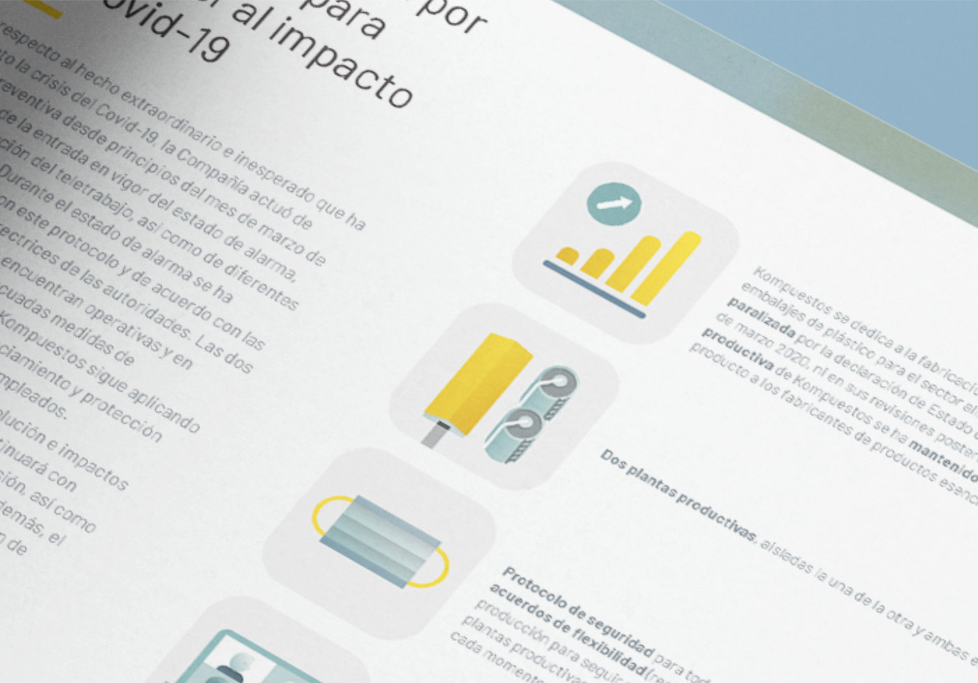
Unlike the usual use given to them in the interface of an app, the icons used in documents such as submissions, reports or infographics complement the text and at the same time rely on it. The combination of icon and text helps to contextualize concepts, which offers us greater creative freedom when it comes to representing them graphically. Since these icons don't need to be self-explanatory, it's recommended to keep one foot in the descriptive And another one in the allegorical.
The purpose of an icon is to represent At a glance an idea. Therefore, when selecting or designing an icon, we must bear in mind that creativity must always be at the service of the message, never the other way around. To achieve this, there are two fundamental aspects: simplicity and contrast.
When we talk about simplicity, the secret lies in limiting ourselves to using basic forms and never abusing details, since their excess worsens the visibility of any type of graphic element. This is especially important when it comes to resources intended to occupy few pixels on the screen.
On the other hand, when we talk about contrast, we leave the territory of forms to enter the world of color. The design of a good icon requires a clear contrast between the figure and the background. You must avoid nuances, because otherwise the shapes blur, diluting the message in the process. Instead, using a combination of neutral colors with an accent color, we can Direct attention from the public to the key points of a document.

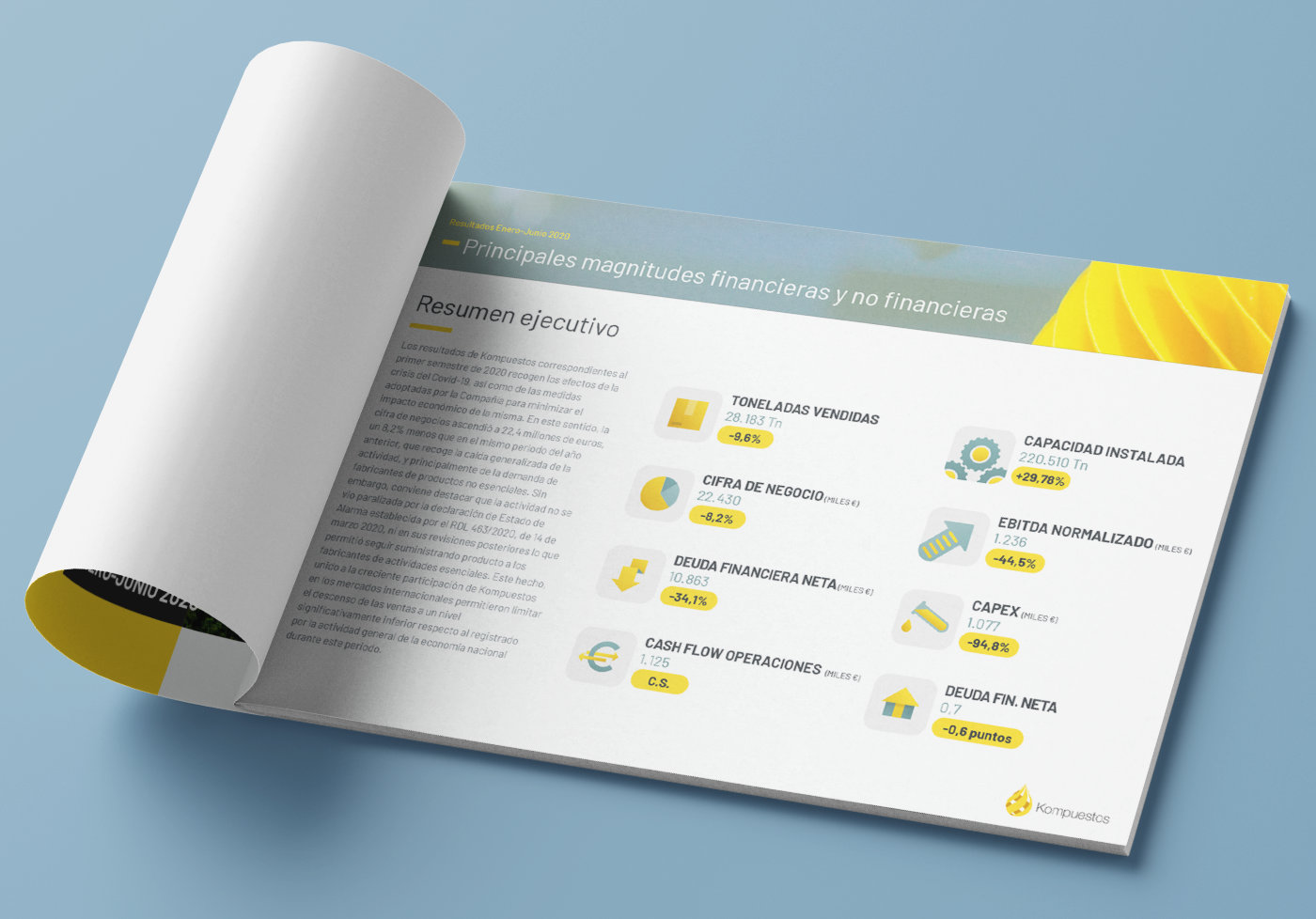
The result of applying these two basic concepts creatively is an icon that will be clearly visible and understandable both in small sizes at close range (and in a Results Report Or a video corporate intended for networks Social), such as on a larger scale, if we are talking about internal presentations or large events (such as a General Shareholder Meeting).
It must reflect the company's corporate identity
Every piece of a company's communication is part of an effort to convey a consistent speech. Therefore, the documents published in the field of Investor Relations they must be carefully crafted both in the background and in the form, using the appropriate tools and using the corporate style guide as a starting point. These guides are aimed at the correct application of the brand in terms of colors, typography, photographic style and other visual elements. If you don't contemplate using icons, your general recommendations may offer some clues as to possible styles appropriate for them.
Building a living and versatile iconographic language that breathes the qualities of the company reinforces the consistency of the discourse. In addition, it provides an invaluable aid to those responsible for preparing documents, especially if it is a created visual language ad-hoc to represent concepts specific to a particular sector.

It must be part of a homogeneous graphic system
Combining icons from different sources is always a bad idea. Not only does it make it very difficult to correctly represent the company's corporate identity, but it also results in documents whose production It seems improvised. In addition, combining disparate graphic styles risks distracting the audience/reader.

A homogeneous iconographic system coexists in balance with the other visual elements of the brand, allows us to represent a wide range of concepts under a unified style and facilitates the creation of new icons and variations.
In short...
The creative use of iconographic resources in the context of PR represents an inestimable advantage in the process of producing documents and communication tools with Investors and Shareholders.
-
Juan José Ros
Founding partner of Sigma Rocket